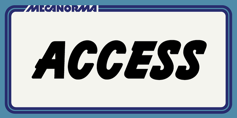
In a world where typography has become increasingly important for both digital and print applications, the Access MN Font stands out as a versatile and highly adaptable typeface. Designed with accessibility in mind, it manages to balance both form and function to create a font that is not only visually appealing but also highly readable for a wide range of audiences. Let’s delve into the origins, characteristics, and uses of Access MN to understand why it has become a favorite among designers.
The Origins of Access MN
Access MN was created to cater to the need for a typeface that is friendly, legible, and universal, making it suitable for a wide variety of applications. The font was originally designed by a team of typographers who focused on bridging the gap between aesthetic quality and practical functionality. The name itself—Access MN—hints at its inclusive nature. The “Access” part of the name suggests a focus on universal usability, while “MN” stands for “Modern Neutrality,” reflecting its clean and contemporary design.
The designers behind Access MN drew inspiration from classic grotesque and humanist styles but sought to create something that felt inherently more approachable. Unlike many traditional grotesque fonts that can appear too rigid, Access MN was designed with softer lines and open character shapes, lending it a welcoming feel. The team also took care to include a wide range of weights and styles to ensure that the font would be versatile enough to handle both display and body text effectively.
Key Characteristics
Legibility and Clarity
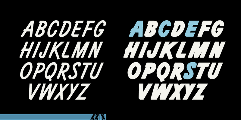
One of the most significant characteristics of Access MN is its exceptional legibility. The font was created to ensure that it could be easily read by individuals with varying levels of visual acuity. This focus on accessibility makes it an excellent choice for public-facing documents, signage, and user interfaces where clarity is paramount. The font’s x-height is slightly larger compared to typical grotesque typefaces, which means the lowercase letters are more readable, especially at smaller sizes.
Additionally, Access MN incorporates generous letter spacing and clear differentiation between similar characters. For instance, the capital letter “I” and the lowercase letter “l” are visually distinct, helping to avoid confusion—a common issue in many sans-serif fonts. The result is a typeface that is easy on the eyes and works well across a range of media, from print to digital screens.
Modern Aesthetic
Despite its focus on accessibility, Access MN does not sacrifice its aesthetic value. The font carries a modern, sleek appearance, with subtle geometric influences that add a sense of precision without feeling overly mechanical. This balance makes it suitable for a wide range of applications, from branding to editorial use. Its neutral character allows it to blend well in many contexts, without overpowering the content it conveys.
The design also features soft curves and balanced proportions, which give the font a friendly and approachable tone. This makes Access MN particularly effective in branding scenarios where trust and friendliness are key aspects of communication. Its clean lines and subtle details also contribute to its versatility, allowing it to be paired easily with other fonts without creating visual discord.
Weights and Styles
Access MN comes in a comprehensive range of weights and styles, from Thin to Extra Bold, along with matching italics. This wide variety of styles allows designers to maintain a consistent type palette across different contexts while still achieving variation and emphasis where needed. The lighter weights are ideal for delicate, refined uses, while the heavier weights command attention in headlines and display applications.
The italic styles are crafted with a gentle slant and slight adjustments to character shapes, making them ideal for emphasis without feeling disruptive. These italics retain the font’s readability, ensuring that they can be used effectively even in longer passages of text. The entire type family is designed to work harmoniously together, offering both consistency and flexibility.

Applications of Access MN
Web and Digital Interfaces
Access MN shines in digital environments, making it a popular choice for websites, apps, and other screen-based applications. The font’s clarity at smaller sizes, combined with its modern aesthetic, means it is well-suited for user interfaces where readability is key. The font also performs exceptionally well on different types of screens, from high-resolution displays to more modest devices, ensuring a consistent experience for all users.
Another advantage of Access MN in digital interfaces is its ability to render clearly across various screen resolutions and operating systems. The designers took special care to ensure that the hinting—the instructions that help characters display correctly on low-resolution screens—is optimized, providing clean lines and avoiding pixelation or blurriness.
Print Media
While Access MN is highly effective in digital formats, it also excels in print. Its versatility makes it ideal for brochures, posters, magazines, and other printed materials. The range of available weights and styles means it can handle both headlines and body copy with ease, while maintaining a cohesive and polished appearance.
The font’s open character shapes and balanced proportions help maintain legibility even at smaller print sizes, making it a reliable choice for long-form reading. Its neutral and modern design ensures that it complements a wide range of content, from corporate reports to lifestyle publications.
Signage and Wayfinding
Given its emphasis on legibility, Access MN is also well-suited for signage and wayfinding systems. The clear differentiation between characters and its ability to remain readable at a distance make it an excellent choice for environments where quick comprehension is necessary, such as airports, hospitals, and public transportation hubs. Its modern and neutral aesthetic also lends a professional feel to any signage, ensuring that it is both functional and visually appealing.
Pairing Access MN with Other Fonts
One of the key advantages of Access MN is its ability to pair well with other fonts. Its neutral design allows it to complement more expressive typefaces, creating a balanced and harmonious typographic palette. For instance, it can be paired with a serif font for editorial content, where Access MN takes on the role of headings or captions while the serif typeface is used for the main body text.
It also works well with script or decorative fonts in branding and packaging design, where the neutrality of Access MN can provide balance against the more flamboyant characteristics of a decorative type. Its adaptability makes it a valuable tool for designers looking to create contrast and emphasis without clashing.
Conclusion
Access MN Font is a masterclass in balancing aesthetics and functionality. Its modern, neutral design, combined with an emphasis on legibility and accessibility, makes it a versatile choice for a wide range of applications. Whether used in digital interfaces, print media, or wayfinding systems, Access MN manages to convey information clearly and effectively while maintaining a polished and professional appearance.
Its range of weights and styles, combined with its ability to pair well with other fonts, ensures that Access MN is a typeface that can meet the diverse needs of modern designers. In a world where accessibility is increasingly important, Access MN stands out as a typeface that genuinely lives up to its name—making design accessible to all.
Ready to discover more fonts like Access MN? Explore our collection and find the perfect typeface for your next project! Continue your search here.

